Sunday, March 18, 2018

Japan Comes To Indiana: Wilhelmina Seegmiller's Botantical Prints

Wilhelmina Seegmiller (1866-1913) is not an artist likely familiar to most of my readers.  She was born in Canada, received her early training in the Goderich, Ontario schools, and later studied in Toronto.  In 1884, she moved to Grand Rapids, Michigan, where she passed the teacher's examination and, at the age of 18, was appointed a teacher in the primary grade at the Wealthy Avenue school.  In a matter of years, she was appointed the principal of that school, all the while studying art in her spare time.  In 1888, she was appointed the director of arts in the public schools of Allegheny, Pennsylvania.  In 1893, she entered the Pratt Institute's School of Fine and Applied Arts and, after graduation, traveled to Europe.  In 1895, Seegmiller came to Indianapolis, Indiana as its director of art instruction in the public schools, a position that she held until her premature death in 1913.

Photograph of Wilhelmina Seegmiller

As you may have gathered by now, Seegmiller's contributions were primarily as an early proponent of art education in American public schools.  She encouraged schools in Indianapolis to use professional artists to teach art and, in 1909, she convinced the Indianapolis legislature to pass a law to allow school boards to split fifty cents of each taxable hundred dollars with the associations for art education in cites that had art associations.  Although unable to personally attend, she was one of four Americans invited to represent the United States at the International Congress of Art Educators and Manual Training Teachers in London in 1908.  Through her involvement in the Art Association of Indianapolis, she also promoted greater interaction between local museums and schools by having the museums admit teachers and students for free, provide weekly illustrated lectures, make instruction in art and design available for teachers at reduced rates, and provide advanced pupils with free instruction in drawing at the John Herron Art Institute.

Beachfront Property by Wilhelmina Seegmiller
Courtesy of the Indianapolis Museum of Art
(watercolor)

As an author, she wrote a series of "Applied Art Drawing Books" for the first eight grades that became a standard text in American schools.  Another book set forth a four year study of "Primary Hand Work" that including weaving and basket-making.  She co-edited a series of "The Riverside Readers," anthologies of literature, poetry, and history with accompanying study guides.  She also published a number of collections of her own poetry such as "Little Rhymes for Little Readers" in the vein of Robert Louis Stevenson's "A Child's Garden of Verses."  One of these books, "Sing a Song of Seasons," was illustrated with her own botanical artwork.
Illustration by Wilhelmina Seegmiller from Sing a Song of Seasons (1914)

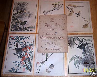
Evidently, Wilhelmina Seegmiller greatly admired Japanese prints, and did her best to make sure her art teachers were exposed to them.  At some point, her paths crossed with Sogo Matsumoto.  According to the December 19, 1903 edition of The Minneapolis Journal, Matsumoto was "busily engaged in preparing illustrations for a teachers' textbook of drawing."  I suspect that the textbook in question was one of Seegmiller's "Applied Art Drawing Books," which were published by Atkinson, Mentzer & Grover.

Cover of Applied Arts Drawing Books: Fifth Year (1908)
by Wilhelmina Seegmiller

The details of Sogo Matsumoto's life are somewhat sketchy.  It is known that he traveled to Paris in 1900 and that he met James Whistler, who encouraged him to respect the traditional arts of Japan. Upon returning to Japan, he founded The Matsumoto Print Works, a mail-order business in Nagoya that published woodblock printed reproductions of traditional Japanese prints.  These reproductions were allegedly admired by no less than Arthur W. Dow in their day.  Matsumoto received his Masters of Arts from Yale in 1901, and by 1906 was living in New York City.  In 1913, he was elected as a Member of the Imperial Diet, representing the prefecture of Miye.  The Great Kanto Earthquake of 1923, however, appears to have ended his print publishing business, and Matsumoto enlisted the help of the ceramics painter Kataro Shirayamadani, who worked at Cincinnati's Rookwood Pottery, to help him dispose of his remaining stock.  An avid collector and dealer of Japanese and Chinese prints, his collection was frequently exhibited at various venues throughout the United States, and he sold (or donated) prints and textiles to American museums such as the Met, the Rhode Island School of Design, and what is now known as the Jordan Schnitzer Museum of Art.  Matsumoto authored a monograph entitled "The Making of Color Prints" and, later in life, was the Director of the Far Eastern Cultural Center in 1938-1940.

Catalog for The Matsumoto Print Works

Seegmiller appears to have commissioned Matsumoto's company to turn at least five of her botanical drawings into woodblock prints.  Four of these prints were distributed in the U.S. by Atkinson, Mentzer & Grover.  These prints are as follows:

Original sleeve for Atkinson, Mentzer & Grover set of Seegmiller woodblock prints

 
Spiderwort (c. 1908) by Wilhelmina Seegmiller
Courtesy of the Indianapolis Museum of Art
(woodblock print)

 Flower Study (c. 1908) by Wilhelmina Seegmiller
Courtesy of the Indianapolis Museum of Art
(woodblock print)

Queen Anne's Lace (c. 1908) by Wilhelmina Seegmiller
Courtesy of the Indianapolis Museum of Art
(woodblock print) 

Wisteria (c. 1908) by Wilhelmina Seegmiller
Courtesy of the Indianapolis Museum of Art
(woodblock print)

The Matsumoto Print Works also produced this additional Seegmiller design:

 
Squash Blossom (c. 1907) by Wilhelmina Seegmiller
Courtesy of the Indianapolis Museum of Art
(woodblock print) 

The Indianapolis Museum of Art also has a "Blossoms in Vase" work by Seegmiller in its Prints, Drawings, and Photographs Collection, but it is not imaged and the medium of that work is not specified.

Wilhelmina Seegmiller's woodblock print seal


Atkinson, Mentzer & Grover also distributed a least two sets of woodblock print reproductions made by Matsumoto's company largely based on designs from Imao Keinen's Keinen Kacho Gafu.  Accompanying material for the second set indicates that the prints were "selected" by Wilhelmina Seegmiller.  

Japanese Prints No. 2 (selections from Keinen Kacho Gafu by Imao Keinen)
Courtesy of Dennis Gibbons
(woodblock print reproductions)


Japanese Prints No. 2 (selections from Keinen Kacho Gafu by Imao Keinen)
(woodblock print reproductions)


1/17/21 Addendum:  I was recently contacted by Mark Burkeitt, who runs the Era Woodblock Prints website.   Mark recently acquired a collection of Sogo Matsumoto prints, as well as a print catalog circa 1913 and a company statement.   These materials confirmed that Matsumoto acted as a publisher for the likes of Ohara Koson, Arai Yoshimune, Aoki Seiko, and Yamamoto Shoun and also produced ukiyo-e reproductions of prints by Hiroshige and other nineteenth century Japanese artists.  Matsumoto also acted as a distributor in the United States of woodblock prints made by other Japanese publishers as well.

Mark is in the process of uploading these Matsumoto prints for sale on his website, and I encourage you to check them out.   Because the catalog might be of interest to collectors and scholars, I have reproduced it below with Mark's permission:


This is Matsumoto's offer to distribute the prints of other Japanese woodblock print publishers in the United States:

And one last letter from 1910:

If a comment box doesn't appear below, click on this link instead: http://easternimp.blogspot.com/2018/03/japan-comes-to-indiana-wilhelmina.html

Monday, February 19, 2018

A Jacobian Mystery: The Re-Proof Is in the Pudding

Last year, I acquired the following print of the Taj Mahal.   It's a familiar Taj Mahal woodblock print by Charles W. Bartlett, right?   Not exactly.

Taj-Mahal. Agra. 1916. (c. 1916?) by Charles W. Bartlett
Personal collection

This is the Bartlett woodblock print published by Watanabe Shōzaburō:

 Taj-Mahal. Agra. 1916. (1916) by Charles W. Bartlett
Courtesy of The Art of Japan
(woodblock print)

The colors are not exactly the same (and the blue color is somewhat faded), but that is the least of the differences.  The major distinction is that former isn't a woodblock print at all, as I'll get to in a moment.  Moreover, the plate size of the print is 10-3/4" by 7-7/8", making it considerably smaller than Bartlett's woodblock print, and the reduced image is slightly cropped at the margins.  The print is inscribed in the plate with the word "RE-PROOF" and is signed by E. Jacobi in ink in the lower right margin.  (A facsimile of Bartlett's name appears in the lower left margin.)  Bartlett's red © copyright notice is also missing in the print.

Close-up of the re-proof print by E. Jacobi

So who is "E. Jacobi"?  Some Internet sleuthing revealed that an E. Jacobi made re-proof etchings of etchings by the likes of J. Alphege Brewer, Vaughan Trowbridge, and Ferdinand Jean Luigini, but most of the links did not otherwise indicate the artist's first name.  Unfortunately, a couple of sites erroneously identified "E. Jacobi" as "Eli Jacobi" (1898-1984), a WPA artist known for his black and white linocuts during the Depression, which sent me off on a wild goose chase.  I was able to track down Eli Jacobi's nephew, but he was not familiar with any re-proofs done by his uncle.  Moreover, the time-line didn't jive.  While the Jacobi etching isn't dated beyond reproducing the 1916 date carved in the Bartlett woodblock, advertisements for other E. Jacobi re-proof etchings were published during World War I, which would have meant that Jacobi would have had to have taken up etching as a teenager.  Moreover, I learned from Eli Jacobi's nephew that Eli Jacobi spent the 2 years between 1915 and 1917 jailed by the Ottoman Turks in Jerusalem after he left Russia before becoming an art student at Bezalel art institute and then emigrating to the United States after he was expelled from Palestine, thus precluding his involvement with those re-proofs.

Around The Corner (c. 1939) by Eli Jacobi
Courtesy of Paramour Fine Arts
(linocut)

I then found this Jacobi re-proof etching of a T.F. Simon design, so I contacted my friend, Catharine Bentinck, who runs the premiere website devoted to Tavik Simon's life and work to see if she had any information about the mysterious E. Jacobi.  She, in turn, was able to direct me to Benjamin Dunham's impressive website devoted to J. Alphege Brewer's life and work to find the answers to almost all of my questions.

Uhelny Trh, Prague (1910) by T.F. Simon
(re-proof by E. Jacobi)

Thanks to Benjamin Dunham's research, I now know that "E. Jacobi" is Emil Jacobi (1853-1918), a Bavarian-born photographer who emigrated to the United States in 1878.  Although commonly referred to as "re-proof etchings" in the trade, what Jacobi produced were not etchings at all, but re-proof prints made after etchings.  In 1880, Jacobi was awarded an patent for an improvement in the "Process of Producing Phototype-Plates.  As described by Jacobi himself in a chapter of Frederick H. Hitchcock's The Building of a Book (The Grafton Press, 1906), he would photograph an original artwork to create a contact negative and used the contact negative to make a plate with the photo-gelatine process.  In this process, the areas exposed to light became hardened raised surfaces capable of holding ink in gradations.  Then Jacobi colored the plate for each impression, made the impressions, and signed them with his own name and a close imitation of the artist’s signature.

Rheims Cathedral (The Rose Window) (1914) by J. Alphege Brewer
Courtesy of www.jalphegebrewer.info
(re-proof by Emil Jacobi)

Durham says that it is unknown if Jacobi's reproductions were authorized by European artists during World War I as a way of maintaining sales when shipping across the Atlantic was undependable or simply as a means of expanding the market for such artists' works.  I doubt that they were authorized.  As Durham notes, it would have been an extra selling point if Jacobi could have advertised “authorized re-proofs,” but he didn’t.  Moreover, in the case of Bartlett, Jacobi would have had to have tracked Bartlett down, not in Europe, but either in Japan in 1916 or in Hawaii thereafter.  For more about Emil Jacobi, see Benjamin Durham's article on his J. Alphege Brewer website.

Emil Jacobi's label for the Rheims Cathedral (The Rose Window) re-proof
Courtesy of  curtissvintageprints.blogspot.com

Jacobi's Taj-Mahal, Agra. 1916. phototype print is also seemingly unique in his output as it appears to be the only example of Jacobi reproducing a woodblock print, rather than an etching, with the photo-gelatine process.  Why Jacobi selected this particular Bartlett woodblock image for reproduction, however, is likely one mystery that will never be solved.  Bartlett himself would later create several etchings of the Taj Mahal, although none are identical in composition to any of his woodblock prints.

If a comment box doesn't appear below, click on this link instead: http://easternimp.blogspot.com/2018/02/a-jacobian-mystery-re-proof-is-in.html

Tuesday, January 30, 2018

Lilian Miller's Uncatalogued Prints

I knew I'd get around to posting something about Lilian Miller (1895-1943) at some point, but I've held off doing so up until now simply for a lack of anything new to say about her.  The definitive monograph on Miller remains Between Two Worlds: The Life and Art of Lilian May Miller by Dr. Kendall H. Brown published nearly twenty years ago in connection with an exhibition that opened in 1998 at the Pacific Asia Museum.  Other than providing a few preliminary remarks about her life, I refer my readers to that publication for the details of her biography.

Lilian Miller's passport photo (1918)
Courtesy of Wikipedia

Although often lumped in the same breath as Helen Hyde, Bertha Lum, and Elizabeth Keith, Miller has always stood apart for me for various reasons.  Unlike Hyde, Lum, or Keith, Miller was born in Japan, spending her formative years in Tokyo until her father was transferred to Washington, D.C. in 1909 when she was 14.  While in Japan, Miller had five years of training in painting and drawing from Japanese artists such as Kano Tomonobu and Shimada Bokusen, and resumed her studies with Bokusen after college when she returned to Japan in 1919.  While Hyde, Lum, and Keith all studied the process of woodblock carving and printing (and Lum and Keith actually made a limited number of prints in which they were responsible in whole or in part for carving and/or printing their designs, usually out of necessity), the trio generally relied upon professional Japanese carvers and printers to make their prints.  Miller did too, at the outset of her career.  However, once she gained sufficient technical proficiency in both skills, she not only began to self-carve and self-print her work, but continued to do both for rest of her career.  These facts arguably make Miller's woodblock prints on the whole the most authentically "Japanese" of any produced by this famous quartet of female printmakers.

Woman Under Umbrella - early drawing for Tokyo Coolie Boy (c. 1920) (ink on paper);
Tokyo Coolie Boy A (1920) and Tokyo Coolie Boy B (1928) (colored woodblock prints) 
by Lilian Miller
Personal Collection

Rain in the Willows (undated) by Lilian Miller
Courtesy of Hanga.com
(colored woodblock print)

Paradoxically, I've always found Miller's prints generally to be the least interesting of the lot (and don't get me started on her poetry).  She lacks Keith's eye for architectural and anthropological detail, she is uninterested in stuff of myths and legends like Lum was, and the few prints that do feature mothers and/or their children are relatively bland and static when compared to Hyde's prints. Far too many of her designs look more like kitschy book or magazine illustrations of the day.  It's not just that she depicts a romanticized Orient, but that more often than not, it's a stereotypically romanticized view full of generic depictions of Fujis, sampans, umbrellas, toriis, and bonsais (though I will admit that the quality of her printing can not be fully appreciated from most photographic reproductions of her work.

Sunrise at Fujiyama, Japan (1928) by Lilian Miller
Courtesy of Hanga.com
(colored woodblock print)

I've never had much interest in most artists' sexual identities.  If Lilian Miller preferred to be called "Jack" by her friends and family, wore trousers in private, kept her hair short, and had intense female friendships, that was her business.  It certainly didn't overtly manifest itself in her designs in the way that, say, Paul Jacoulet's sexual orientation sometimes did.  Indeed, if anything, it is somewhat ironic that so many of her prints are filled with phallic images of tree trunks, bamboo stalks, stone lanterns, and building columns.  To misquote Freud, though, maybe sometimes a tree trunk is just a tree trunk.

Drum Tower, Nikko, Japan (undated) by Lilian Miller
Courtesy of Hanga.com
(colored woodblock print)

Festival of Lanterns, Nara (c. 1934) by Lilian Miller
Courtesy of Castle Fine Arts
(colored woodblock print)

Spray of Bamboo (1938) by Lilian Miller
Courtesy of Robyn Buntin of Honolulu Gallery
(lithotint)

On the theory that even a blind pig can sometimes find an acorn in the woods, Miller was clearly capable on occasion of producing superior work.  In my view, her best design is "The Crescent Moon Rides [sic: Runs] Low," Korea.  It is an evocative, naturalistic landscape that eschews her usual stereotypical imagery and lacks any whiff of kitschy illustration.  What makes the design work so well is almost entirely due to Miller's ability to successfully employ various effects unique to woodblock printing into an aesthetically-pleasing and harmonious whole.  The most striking feature of this aiban size print, of course, are its mountains, repeatedly overprinted to created a deeply saturated shade of dark purplish-blue.  Then there's Miller's dramatic use of bokashi (gradation printing) in the sky to indicate what I assume is the beginning of the morning sunrise, with some subtler use of bokashi on the water.  The earth is printed in a speckled fashion that I believe is gomazuri (sesame seed pattern) or some other printing technique closely akin to gomazuri.  Finally, the whirls in bottom right corner are baren-suji, intentional circular marks created by the pressure applied from the printing tool ("baren") moving in a circular pattern on the back of the print during the printing process.

"The Crescent Moon Rides Low," Korea (large version) (1928) by Lilian Miller
Personal Collection
(colored woodblock print)
 
"The Crescent Moon Rides Low," Korea (large version) (1928) by Lilian Miller
Courtesy of Castle Fine Arts
(colored woodblock print, test print with stronger colors)

  Recently, I was offered a Miller print by Frank Castle of Castle Fine Arts that is not found in the Brown catalog.  It is a cut down version of "The Crescent Moon Rides Low," Korea, less than half as wide and cropped by approximately one centimeter at both the top and bottom.  The bokashi work in sky is flatter and less elaborate (and missing altogether in the water), the green vegetation lacks detail, there is a small area which Miller appears to have forgotten to fill in, and the registration isn't perfect in places.  There are monograms in each bottom corner (her signature appears outside this portion of the image in the large print.)  But perhaps the most interesting feature of this print besides its size is the fact that Miller used crayon and pencil to depict certain attributes of the print, including its border.

"The Crescent Moon Rides Low," Korea (cut-down state) (c. 1928-1935) by Lilian Miller
Personal Collection
(colored woodblock print with graphite and crayon)

This cut-down state came from the estate of Mrs. Adele Buckner, wife of Lt. General Simon Boliver Buckner, Jr., the head of the Alaska Defense Command at the time of the outbreak of WWII and who was subsequently killed in the Battle of Okinawa.  Adele Buckner spent three weeks vagabonding across southwest Alaska with Miller in 1941, which Buckner recounted in an article for Alaska Life.  She was also one of Miller's friends who handled Miller's estate after her death from cancer in 1943.  My surmise is that this was a non-commercial gift print, likely one made several years after the original publication of the larger version and printed in extremely small quantities.

"The Crescent Moon Rides Low," Korea aka "Moonlight Over the Blue Hills of Korea"
(postcard size) (undated) by Lilian Miller
Personal Collection
(colored woodblock print marked "Best Copy" in upper left margin)

Miller also produced a related, postcard size version of "The Crescent Moon Rides Low," Korea.  The Brown catalog does not date this print but it is sufficiently stylistically different and more technically accomplished than Miller's early postcard size prints that I have to believe that it dates to at least 1928, and most likely to the early to mid-1930s when Miller was repurposing a number of her prior designs. Several years after this post was written, another copy turned up attached to greeting card stock, suggesting it was made by Miller as a holiday card for friends and family members. 

As it turns out, the cut-down state was not my first encounter with Adele Buckner.  Back in 2006, I acquired at an auction not only Miller's postcard size print and and the related aiban size version shown above from the Buckner estate, but also a minor color variant (likely a test proof) and Miller's original watercolor for the postcard printing size design.

"The Crescent Moon Rides Low," Korea aka "Moonlight Over the Blue Hills of Korea"
(c. 1928-1935) by Lilian Miller
Personal Collection
(watercolor)

"The Crescent Moon Rides Low," Korea aka "Moonlight Over the Blue Hills of Korea"
(postcard size) (undated) by Lilian Miller
Personal Collection
(colored woodblock print believed to be minor color variant or trial proof)

Prior to receipt of the cut-down state of the aiban size version, I was under the misapprehension that it was going to be a cut-down variant of the postcard size version, which would entirely be in keeping with it being a gift print.  As it turns out, once I saw the cut-down state in person, it was clear that the design wouldn't have worked in the half-postcard or even full postcard size format (and I happily wound up with more than twice as much print for the price.) But I have to wonder, with all of these prints and the one watercolor in Buckner's possession, did the cut-down state inspire Miller to create the postcard size version?

Lilian Miller in kimono at the Nicholson Gallery,  (April 1930) by Dickson & Thurber
Courtesy of Vassar College

As Ken Brown notes, Miller also produce a stylistic and thematic variant of "The Crescent Moon Rides Low," Korea print 6-7 years later, flipping the foreground hillock from right to left, expanding the river to fill the center of the picture, and replacing the sleepy village with a shrine gate.

Blue Hills and Crescent Moon (1934/1935) by Lilian Miller
Courtesy of Hanga.com
(colored woodblock print)

Until recently, there is one other known print omitted from the Brown catalog that came to light after the Pacific Asia Museum exhibition was over.   (Remember, the catalog was published when the Internet was still in its infancy and on-line access to dealer stock a
nd museum holdings was virtually nil.  In contrast, the standard catalogs on Hyde, Lum, and Keith fail to list or illustrate a substantial number of those artists' print designs.)  That missing print is called "Pagoda of the Evening Star," published in 1931.

Pagoda of the Dragon Star (1931) by Lilian Miller
Courtesy of the USC Pacific Asia Museum
(colored woodblock print)
 
A reduced version of this print in a different color scheme is also known to exist: 

Pagoda of the Dragon Star (1931) by Lilian Miller
Courtesy of Fuji Arts
(colored woodblock print)

Several years after this post was originally written, however, a collection of Lilian Miller material held by a family member came up for sale at Castle Fine Arts which included this print said to have been made exclusively as a Christmas card for a Miller friend and her child on Christmas Day:

"A Korean Mother and Child" (c. early 1920s) by Lilian Miller
Personal Collection
(colored woodblock print with applied watercolor)

That collection also included the following trial prints or color variants not noted in the Brown catalog:

 
"Morning Snow on Bamboo, Japan" (c. 1927) by Lilian Miller
Courtesy of Castle Fine Arts 
(colored woodblock print, color variant of "Morning Snow on Bamboo, Japan A")


"Makaen Monastery, Diamond Mountains, Korea" (1928) by Lilian Miller
Courtesy of Castle Fine Arts 
(colored woodblock print, color variant)

"By the Great River Han, Korea" (1920) by Lilian Miller
Courtesy of Castle Fine Arts 
(colored woodblock print, color variant)

A bit of Miller ephemera:

Cover of an advertising leaflet (c. 1920s)
printed in Yokohama by the Box of Curious Press
Personal Collection

I'll conclude this post with two examples of Miller's late watercolor style which, wouldn't you know it, both feature tree trunks:

Untitled Nikko scene (c. 1934/1935) by Lilian Miller
Courtesy of Castle Fine Arts
(watercolor)

 Untitled Nikko scene (c. 1934/1935) by Lilian Miller
Courtesy of Castle Fine Arts
(watercolor)

Close-up from a larger portrait of Lilian Miller (c. 1940)
Courtesy of the Lilian Miller Collection, Scripps College

If a comment box doesn't appear below, click on this link instead: http://easternimp.blogspot.com/2018/01/lilian-millers-uncatalogued-prints.html.