
Frances Baker aboard a ferry to Sado Island (1937)
Courtesy of the Blakemore Foundation
But Frances Lee Wismer Baker Blakemore (1906-1997) had a now largely-forgotten career as a woodblock and linocut print artist in Washington State and in Japan prior to WWII. Born Frances Lee Wismer in Pana, Illinois in 1906, her family moved to Spokane, Washington, in 1908 when her German immigrant father won eighty acres of homestead land in a lottery. After her father died in 1915, her mother remarried and moved with Frances and her sister to Mabton, Washington. After graduating high school in 1924, Frances Wismer studied art part-time at the University of Washington in Seattle under Walter Isaacs and Helen Rhodes, finally graduating in 1935. To support herself and to pay for tuition during that ten-year period, she gave private art lessons, was a substitute art teacher, sold home-made jewelry, worked summers as an apple packer, illustrated children's books, and was a commercial graphic artist for local businesses.

High Water at Moore's Point (1930) (from Twelve Block Prints of Lake Chelan)
by Frances Wismer
Courtesy of the Seattle Art Museum)
(linoleum-block print)
Frances Wismer was making linoleum-block prints at least as early as 1928. In 1929, she submitted seven such prints to the first annual exhibition of the Northwest Print Makers (later called Northwest Printmakers), winning the Purchase Prize for her work High Water at Moore's Point, Chelan. In 1930, she collaborated with her friend Grace Perry to publish Twelve Block Prints of Lake Chelan, contributing six designs. She would continue to submit prints (and oil paintings) to the Northwest Printmakers' exhibitions over the next ten years. David Martin tells me that Frances also started to make color white line woodblock prints in the 1920s (most now lost or unaccounted for), having learned to make them from her teacher, Helen Rhodes, who had spent time to Provincetown, Massachusetts. In 1935, she submitted the color print Gymkhana to the 1935 Northwest Printmakers exhibition, although no color images of this print (or, indeed, a copy of the print itself), can currently be located.

Reproduced in Territorial Hues: The Color Print and Washington State 1920-1960
by David F. Martin
(color woodblock print)Shortly after graduating from the University of Washington in 1935, Frances married Glenn Baker, a graduate student in the University's English Literature Department. The pair honeymooned in Japan, where the Bakers hoped to find teaching positions. Ultimately, they ended up teaching at such institutions at Hosei University, Keio Medical University, and Waseda High School. Frances Baker also painted murals and drew weekly sketches for Japan News Week. She would remain in Tokyo until 1940, when the political situation arising out of the Sino-Japanese conflict and the beginning of WWII in Europe made remaining in Japan untenable.

Chindon'ya (aka "Street Musicians") (1937) by Frances Baker
Submitted to the 1937 Northwest Printmakers Exhibition
Personal Collection
(linoleum-block print)
While in Tokyo, Frances Baker continued to make black and white linocuts and woodblock prints, most featuring Japanese scenes, and to submit many of them to the Northwest Printmakers Annuals. Besides Chindon'ya, the others of which I am aware are shown below:

[Parade] (c. 1937-1940) by Frances Baker
Courtesy of the Seattle Art Museum
(woodblock or linoleum-block print)

Bel Tower (aka "Zempukuji") (c. 1939) by Frances Baker
Courtesy of the Henry Art Gallery
(woodblock print)

Two Women with Baskets (aka "Basket Carriers") (c. 1939) by France Baker
Courtesy of the Seattle Art Museum
(woodblock print)

Planting Rice (aka Rice Planting) (c. 1939) by Frances Baker
Courtesy of the Seattle Art Museum
(woodblock print)

Purse-Seiners (aka "Jibiki-Ami") by Frances Baker
Submitted to the 1939 Northwest Printmakers Exhibition
Personal Collection
(linoleum-block print)

Boy and Buffalo (1940) by Frances Baker
Courtesy of the Henry Art Gallery
(woodblock print)

Boy and Water Buffalo (c. 1940) by Frances Baker
Courtesy of the Seattle Art Museum
(woodblock or linoleum-block print)

Japanese Bath (c. 1936-1937) by Frances Baker
Courtesy of Shotei.com
(color woodblock print)
In late 1936 or early 1937, Frances Baker commissioned the Japanese publisher Watanabe Shozoburô to make a color woodblock print based on one of her designs of a Japanese bathhouse. Because the blocks were carved and printed by Japanese artisans, this print is far more technically complex than the color woodblock prints that Frances was able to produce on her own. As Marc Kahn notes in an article on Blakemore on his Shotei website, this copy bears an unusual five petal flower seal and an oval Watanabe seal that says "printed by" rather than "published by" Watanabe. While Kahn wonders if this means that the blocks were carved elsewhere, I think this is doubtful. Rather, I think that Blakemore was the publisher who was responsible for all the sales of these prints, and that the oval seal was simply used in order to credit Watanabe's studio as the place where the prints had been made. In fact, all of the other copies that I've seen of this design lack the oval seal altogether.

Children Playing on the Street (c. 1936-1937) by Frances Baker
Personal Collection
(color woodblock print)
A second color woodblock print of children playing a Japanese version of hopscotch was made around the same time. Interestingly, as Kahn also notes, some copies of these prints were signed "F. Wismer Baker" whereas others were signed "Frances L. Baker" (over a partially-erased signature of "F. Wismer Baker"). I can only assume that she decided that her early print work under her maiden name would be unknown to her current clientele or else she no longer felt a need to hide behind a non-specific gender signature to be taken seriously. Unlike Japanese Bath, Children Playing in the Street bears the conventional 6mm round Watanabe seal. This design also appears to have been printed in large quantities, because it turns up with greater frequency in the marketplace than Japanese Bath does. Perhaps the round Watanabe seal was used on this print because Baker and Watanabe came to an agreement whereby Watanabe was to retain and sell a certain number of copies on her behalf (or retained and sold a number of copies on its own behalf as partial payment for Baker's use of Watanabe's artisans).

Sado-ga-shima (1938) by Frances Baker
Courtesy of Martin-Zambito Fine Art
(color woodblock print)
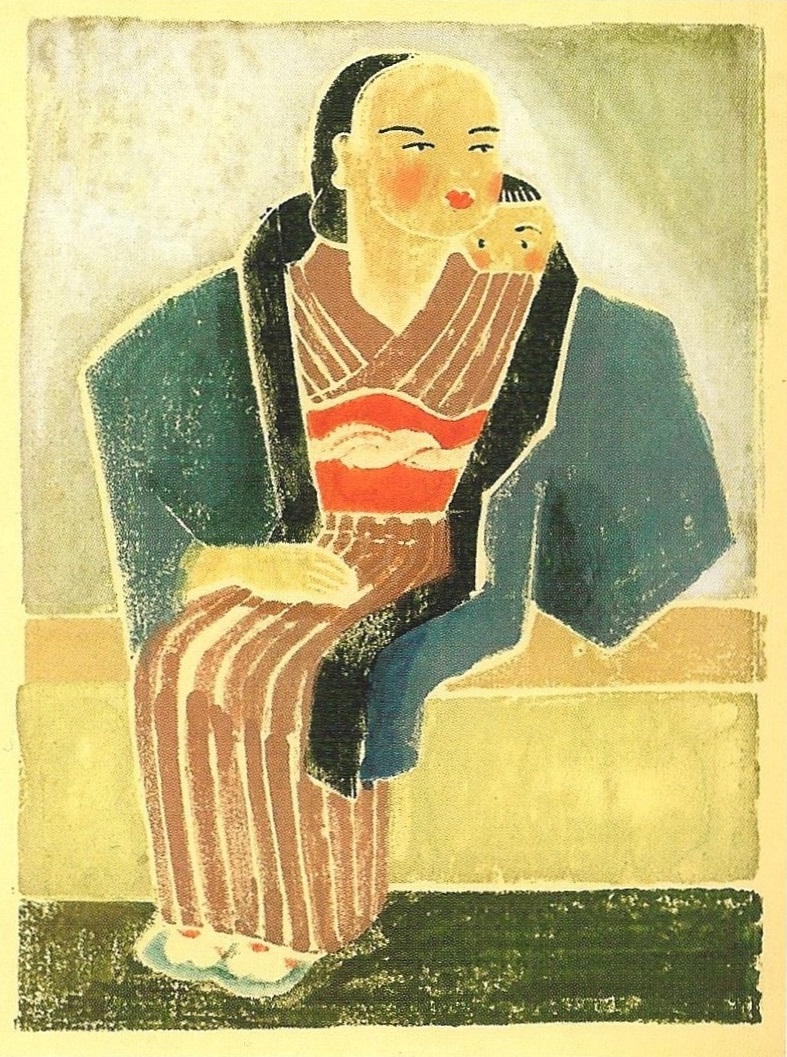
Far Eastern Madonna (1939) by Frances Baker
Reproduced in Territorial Hues: The Color Print and Washington State 1920-1960
by David F. Martin
(white line color woodblock print)

Far Eastern Madonna (1939) by Frances Baker
Courtesy of the Henry Art Gallery
(color woodblock print)
Baker self-carved and printed at least two additional color prints in the late 1930s. The second, called Far Eastern Madonna, won the Purchase Prize of the 1939 Northwest Printmakers Annual.


Cover and bookplate illustration for Awapuhi (1947)
based on linoleum-block print illustrations by Frances Baker
Courtesy of Manu Antiques
While residing in Honolulu during WWII, Frances made linoleum-block prints that were used to illustrate a Hawaiian child book by Elma T. Cabral called Awapuhi. Although it is outside the scope of this blog, Blakemore's most interesting work during this period was designing war propaganda leaflets for the Office of War Information that were dropped on combat areas throughout the Southwest Pacific and the Japanese islands.

War Propaganda Leaflet 2048 (c. 1945) by Frances Baker
Courtesy of Flying Tiger Antiques

War Propaganda Leaflet 414 (c. 1945) by Frances Baker
Courtesy of www.psywarrior.com

War Propaganda Leaflet 2065 (c. 1945) by Frances Baker
Courtesy of www.psywarrior.com

War Propaganda Leaflet 2056 (c. 1945) by Frances Baker
Courtesy of www.pbs.org

War Propaganda Leaflet 2030 (c. 1945) by Frances Baker
Courtesy of www.pbs.org
Frances and Glenn Baker separated during the war and were officially divorced in early 1946. By the summer of 1946, Frances had returned to Tokyo and begun working for Civil Information and Education (CI&E) Section of the Supreme Commander for Allied Power/General Headquarters. She was responsible for designing, producing and circulating brochures, posters, and exhibitions designed to promote the reconstruction process taking place in Occupied Japan. In 1949, she created a booklet called Jeeper's Japan: As Seen by the Occupation as a souvenir for the Occupation staff. It contained 24 illustrations with rhyming couplets providing humorous commentary on life in Occupied Japan.


Cover and two illustrations from
Jeeper's Japan: As Seen by the Occupation (1949) by Frances Baker
Near the end of her tenure at the CI&E, Frances acted as an advisor for The American Fair of 1950 and the Democratization of Japan exhibition in 1951. When the Occupation of Japan ended in 1952, she transferred to the American Embassy in Toyko as an exhibition officer of the United States Information Service, where she worked until 1957. Her biggest project at the American embassy was the Atoms-for-Peace exhibition in 1955. She also collaborated with Oliver Statler on a Modern Prints exhibition in 1952 that toured the United States and which introduced many Americans for the first time to the prints by artists of the sosaku hanga (creative print) movement.

Tom and Frances Blakemore during a hunting trip to Izu Peninsula (1960)
Courtesy of the Blakemore Foundation
Frances had renewed her friendship with Thomas Blakemore in 1948, whom she had briefly met in Hawaii in 1941. The pair grew close and eventually married in 1954. Starting in the 1950s, Blakemore began to make screen prints and the occasional collagraph or etching. They are pleasant enough, but most lack the vitality and raw power of her block prints. Unfortunately, with one exception, it does not appear that she made any further woodblock prints or linocuts after WWII.

Shrine Shadows (1955) by Frances Blakemore
Personal Collection
(woodblock or linoleum block print
printed by a machine using an oil-based pigment)
printed by a machine using an oil-based pigment)

Tea Time (c. late 1950s) by Frances Blakemore
Courtesy of the Henry Art Gallery
(silk screen print)

Children's Matsuri (c. early 1960s) by Frances Blakemore
Courtesy of Martin-Zambito Fine Art
(silk screen print)

Okinawan Dancer (c. early 1960s) by Frances Blakemore
Courtesy of Martin-Zambito Fine Art
(silk screen print)

Untitled (c. 1960s) by Frances Blakemore
Courtesy of Martin-Zambito Fine Art
(silk screen print)

Japanese Fisherman (c. 1960s) by Frances Blakemore
Courtesy of Martin-Zambito Fine Art
(silk screen print)

Soba-ya (c. 1960s) by Frances Blakemore
Courtesy of the Henry Art Gallery
(silk screen print)

Genkan (1970) by Frances Blakemore
Courtesy of Martin-Zambito Fine Art
(silk screen print)

Persimmons (1970) by Frances Blakemore
Courtesy of the Henry Art Gallery
(color woodblock print)
For more information about France Blakemore' s life and career, I recommend the book An American Artist in Tokyo: Frances Blakemore < 1906-1997 < by Michiyo Morioka (University of Washington Press, 2007), the source of most of the biographical information in this post. The chapter in Morioka's book about Blakemore's work designing propaganda leaflets during WWII is particularly fascinating. Special thanks to David Martin, co-owner of the Martin-Zambito Fine Art gallery in Seattle and author of Territorial Hues: The Color Print and Washington State 1920-1960 (Cascadia Art Museum, 2017), who was friends with Frances Blakemore during her retirement years in Seattle and who graciously answered many questions I had about her work.

Frances Blakemore at the Franell Gallery (c. 1980)
Courtesy of the Blakemore Foundation
If a comment box doesn't appear below, click on this link instead: http://easternimp.blogspot.com/2018/08/frances-before-blakemore.html


