Photograph of Kakunen Tsuruoka (c. 1918)
Courtesy of Doug Tsuruoka
Kakunen’s parents died in a typhoid epidemic when he was only four years old. At
age 13, he was sent on a tramp steamer in 1905 with $10 in his pocket to live with Takezo Shiota and his family in San Francisco. Kakunen's exact relationship to the Shiotas is unclear. The family recall him being a "cousin" to the Shiotas via his mother's family line, Kakunen himself called Takezo Shiota "uncle" when he was living with the Shiotas, and census records for 1920 incongruously list Kakunen as Shiota's brother-in-law even though Kakunen had no siblings. Shiota, who founded the T.Z. Shiota antique shop in San Francisco in 1897, put the young Kakunen to work as an indentured servant in his
shop.

In 1918, Kakunen met Charles Erskine Scott Wood, the civil liberties attorney, poet, and artist, when Wood visited Shiota’s shop. Upon learning that Kakunen was paid only board wages, Wood recommended that Kakunen take his brother-in-law to court, which he did, winning a settlement that allowed him to set up his own business selling Asian objects d’art to wealthy Americans. Wood thereafter became one of Kakunen’s first clients. Kakunen’s daughter Sara was named after Wood’s wife, the suffragette and poet Sara Bard Field, and the Woods agreed to be her godparents. Kakunen’s other notable clients included the philosopher John Dewey and the playwright Eugene O’Neill (who Kakunen would visit on O’Neill’s deathbed in Boston in 1953).

Ocean Shore by Kakunen Tsuruoka
(watercolor on paper)
In 1918, Kakunen met Charles Erskine Scott Wood, the civil liberties attorney, poet, and artist, when Wood visited Shiota’s shop. Upon learning that Kakunen was paid only board wages, Wood recommended that Kakunen take his brother-in-law to court, which he did, winning a settlement that allowed him to set up his own business selling Asian objects d’art to wealthy Americans. Wood thereafter became one of Kakunen’s first clients. Kakunen’s daughter Sara was named after Wood’s wife, the suffragette and poet Sara Bard Field, and the Woods agreed to be her godparents. Kakunen’s other notable clients included the philosopher John Dewey and the playwright Eugene O’Neill (who Kakunen would visit on O’Neill’s deathbed in Boston in 1953).


L: Parrot on a Camellia Branch (1920) by
Kakunen Tsuruoka (Personal Collection)
R: Bird on a Branch (1923) by Kakunen Tsuruoka
Kakunen Tsuruoka (Personal Collection)
R: Bird on a Branch (1923) by Kakunen Tsuruoka
(watercolors on paper)

Labels on the back of Macaw on a Camellia Branch
Kakunen would regularly travel to China, Mongolia, and Japan to collect vases and statuary for his clients. He was a close friend of Langdon Warner, the famous archaeologist and Curator of Oriental Art at Harvard's Fogg Museum. The two traveled together to Mongolia at a time when the local warlords had placed a price on Warner's head for appropriating local antiquities. Kakunen also read Chinese and spoke the Shanghai dialect. He was in Shanghai on April 12, 1927, the date of the “Shanghai Massacre” when Nationalist troops under Chiang Kai-shek purged Communists from the Kuomintang and suppressed Communist Party organizations. Kakunen would later recount to his family that, the next day, he saw carts roll past his hotel piled 20 feet high with the bodies of men, women, and children wearing the blue worker uniforms and red armbands of the Chinese Communist Party.

Kingfisher (c. 1930) by Kakunen Tsuruoka
Courtesy of Doug Tsuruoka(watercolor pigments and mineral powder)
Besides
being an art dealer, Kakunen was also a watercolorist in the classical Chinese
tradition, who signed his works with his adopted art name “Kakunen.” Although self-taught, he possessed an
artist’s spirit and painted for the love of it.
In the late 1930s, Kakunen commissioned the Japanese woodblock print publisher Watanabe
Shozoburô to published four woodblock prints based on his watercolor designs. Takezo Shiota had commissioned other prints from Watanabe in the 1930s, which may have inspired Kakunen to follow suit.

Blowing Dust (1942) by Kakunen Tsuruoka
Courtesy of the Arizona Historical Society Library and Archives, Tempe, Arizona
(watercolor on linen)
Despite being a strong opponent of the military government in Tokyo, Kakunen and his family, like other Japanese families on the West Coast at the time, were rounded up and sent to internment camps in the wake of the bombing of Pearl Harbor. In the case of the Kakunen family (Kakunen, his wife Dai, his son Shotaro, and his daughters Matsuko and Sara), they were sent to Poston Camp 2, part of what was officially known as the Colorado River Relocation Center located on the Colorado River Indian Reservation in Arizona. The Poston camp opened in May 1942 and, at its height, held 17,814 incarcerees. The Shiota family was also interned at Poston, and Takezo Shiota died at Poston General Hospital in January 1944. (The internment of people of Japanese heritage during WWII remains one of the most embarrassing incidents in American history. I wish I could say that racial xenophobia was a thing of the past, but sadly that doesn’t seem to be the case, either here in the United States today or in many other supposedly enlightened countries.)

Art Class at the Poston Internment Camp
Courtesy of the California State University Library, Sacramento, California
In addition to serving as a Red Cross Volunteer in the camp, Kakunen supervised
all art activities and produced a number of watercolors of the camp’s surrounding desert and foothills. He eschewed close-up views of the internees and daily camp life. If the camp's buildings were glimpsed, it was at a distance from the desert scrub. As result, there is a prevailing sense of loneliness and isolation in these paintings.

Poston Internment Camp (c. 1943-1945) by Kakunen Tsuruoka
(watercolor on paper)
Most of Kakunen's paintings are held
today by the Arizona Historical Society and the Arizona Memory Project in the
Arizona State Library. Kakunen also made
craft objects of inlaid wood and set up craft exhibitions to display the work
in camp. One of his paintings, “Poston
After Sundown,” won a special award with
a $20 cash prize in an art exhibition sponsored by the Friends Meeting in
Cambridge, Massachusetts in 1943.

Poston After Sundown (1943) by Kakunen Tsuruoka
Courtesy of the Arizona Historical Society Library and Archives, Tempe, Arizona
(watercolor on paper)

Desert Landscape (1943) by Kakunen Tsuruoka
Courtesy of the Arizona Historical Society Library and Archives, Tempe, Arizona
(watercolor on paper)
After the War, Kakunen and his
family moved to New York City, where he established a small business
manufacturing artificial flowers. His
other businesses included Judy’s Arts and Gifts and the Daruma Art Framing
Store and Gallery. Although some online
sources state that Kakunen gave up painting after he left the Poston camp, he
continued to paint in a limited way, sometimes to make merchandise for Judy’s
Arts and Gifts. He also talked of returning to Arizona and the Colorado River area after the war to paint, but never did. After his
retirement, Kakunen spent time traveling
around the world, and was especially fond of Paris. After his death in 1977, Kakunen’s ashes were
returned to Japan for burial in the family plot.

Desert Land and Sky (1944) by Kakunen Tsuruoka
Courtesy of the Arizona Historical Society Library and Archives, Tempe, Arizona
(watercolor on paper)

Industry in the Desert (1944) by Kakunen Tsuruoka
Courtesy of the Arizona Historical Society Library and Archives, Tempe, Arizona
(watercolor on paper)
Of
the four prints commercially published by Watanabe, three are scenes of North
California and one is a kacho-ga depicting a macaw. Most bear a date printed in kanji in the
margin (usually repeated in Arabic numbers in pencil), although it is unclear if these are the dates when the prints were made
or if they are the dates of the original watercolors on which the prints were
based. However, for economic reasons, as well as given the fact that some also specify the month as well as the year in question, I think it most likely that each print design was made in a different year, rather than all at one time at the end of the decade.

Close ups of Kakunen's signature and square seal printed in the image, the
copyright reserved (Hanken shoyū) cartouche in the name of "Tsuruoka Tokutaro"
at upper right, and red circular "Tsuruoka" seal at bottom right
at upper right, and red circular "Tsuruoka" seal at bottom right
Kakunen's first print depicted City Hall (and the nearby War Memorial Opera House) in San Francisco on a foggy night. Through the subtle use of expertly-applied bokashi (printing with gradations of color hand-applied to the block in a nonuniform fashion), the buildings are still visible but suffused in a misty glow. Some on-line sources credit the printing of Kakunen's prints to Watanabe's expert printer Ono Gintaro, who printed designed by artists such as Charles W. Bartlett, Ito Shinsui, Kawase Hasui, and Elizabeth Keith. While Ono Gintaro may well have printed Kakunen's prints, contrary to what has been reported, they contain neither seals nor cartouches that identify him (or anyone else) as the printer in question.

San Francisco City Hall in Night Fog (1936) by Kakunen Tsuruoka
Personal Collection
Edition of 100
(colored woodblock print)
Recently I was able to acquire a group of preparatory material for Kakunen's print designs that the Tsuruoka family still had, such as this preliminary watercolor and pencil drawing of the Golden Gate Bridge. From the outset, it is clear that Kakunen had in mind depicting a pea-soup thick fog that would envelope and obscure much of the bridge itself.

Golden
Gate Bridge in Fog (c. August 1937) by Kakunen Tsuruoka
Personal Collection
(watercolor and pencil on paper)
In the next watercolor, Kakunen starts to work out some of the details of the bridge, reduces the size of the boat in the foreground, and starts to depict the night fog in a rough fashion. He adds a series of lights along the bridge at the left, which were likely dropped from the final design because they would have been camouflaged by the bridge's suspension cables. The note in the box at the lower left roughly translates as "please pay extra attention to this area."

Golden
Gate Bridge in Fog (c. August 1937) by Kakunen Tsuruoka
Personal Collection
(watercolor and pencil on paper)
Early on, Kakunen had a longer boat planned for the design.

Boat Study for Golden Gate in Fog (c. August 1937) by Kakunen Tsuruoka
Personal Collection
(watercolor)
The keyblock print for this print depicts details that will never be fully visible in the finished print design.

Golden
Gate Bridge in Fog (c. August 1937) by Kakunen Tsuruoka
Personal Collection
(keyblock print)
It came as particular surprise to me to learn that, at some point, Kakunen considered replacing the boat with trees at the right to frame the tower across the bay and to impart a Hiroshige-like perspective. Or maybe this was a suggestion that came from Watanabe himself. No doubt it would have looked better once color blocks and more details were added to the trees, but I think Kakunen made the right decision to omit the trees from the final print.

Golden
Gate Bridge in Fog (c. August 1937) by Kakunen Tsuruoka
Personal Collection
(trial print)
I've included a copy of an artist's proof as well the final print below to illustrate just how much the bokashi for the fog will naturally differ from print to print. Even so, greater care seems to have been taken in the printing of the final print, with a conscious decision to sharpen the far tower, to soften the boat, and to make the ripples in the water in the foreground at the left to stand out more.

Golden
Gate Bridge in Fog (c. August 1937) by Kakunen Tsuruoka
Personal Collection
(woodblock print (artist proof))

Golden
Gate Bridge in Fog (August 1937) by Kakunen Tsuruoka
Personal Collection
Edition of 100
(colored woodblock print)
After writing this post, I acquired a complete progressive proof process set for this design:

Golden
Gate Bridge in Fog (August 1937) by Kakunen Tsuruoka
Progressive Proof Process Set
Personal Collection
(colored woodblock prints)
The images are too large to be displayed in full within the margins of this blog, but one can right click with one's mousse, open them up on a new page, and then enlarge the images.
Kakunen's next print lacks fog but is arguably still a nocturne, one that depicts a cottage in the Carmel Highlands at twilight.

Carmel
Highland at Twilight (c. November 1938) by Kakunen Tsuruoka
Courtesy of the Scholten Gallery
(keyblock print)
According to a note on a folder in the family's collection, the cottage depicted in this print belonged to the American heiress Juliet Ector Orr Munsell, a mentor, friend, and surrogate mother figure to Kakunen and his family and a patron of the arts. She was the daughter of Alexander Ector Orr, the Gilded Age financier and philanthropist, the widow of the pioneering color scientist Albert H. Munsell, and a noted color scientist in her own right. Kakunen's grandson subsequently told me that the print was originally conceived as a gift and memento for Munsell, who had the cottage built as a Zen meditation shack overlooking the Pacific Ocean. Kakunen provided the antique Japanese stone basin in the foreground and laid out the rocks in Japanese-garden style. Munsell was also a patron of the Polish-American artist Abel Warshawsky, and is believed to have encouraged him to paint the portrait of Kakunen shown at the end of this post.

Carmel
Highland at Twilight (November 1938) by Kakunen Tsuruoka
Personal Collection
Edition of 100
(colored woodblock print)

Juliet Munsell's cabin in Carmel (c. 1957)
Reproduced in the Monterey Penninsula Herald (June 1, 1957)
Courtesy of Steven Ngo
While this is probably Kakunen's least popular print among Western collectors, it is paradoxically the one that is the most Japanese in spirit. Rather than focusing on some scenic and well-known landmark, Kakunen instead attempts to find the everyday natural beauty inherent in this simple rustic setting. The suggestion of life coming from the light of the cottage window creates a mood not unlike that found in many woodblock prints designed by the likes of Shōti Takahashi or Kawase Hasui.

Tokumochi (post-1923 version) by Shōtei Takahashi
Courtesy of Arelino.com
(colored woodblock print)

Minuma River, Omiya (1930) by Kawase Hasui
Courtesy of hanga.com
(colored woodblock print)
After writing this post, I acquired a complete progressive proof process set for this design:

Carmel
Highland at Twilight (November 1938) by Kakunen Tsuruoka
Progressive Proof Process Set
Personal Collection
(colored woodblock prints)
The
images are too large to be displayed in full within the margins of this
blog, but one can right click with one's mousse, open them up on a new
page, and then enlarge the images.
Kakunen's final commercially-issued print is of a parrot (macaw) on a camellia branch. This must have been a favorite subject for Kakunen, since he painted it at least as far back as 1920 as evidenced by the watercolor shown near the beginning of this post. The image below shows the
preparatory watercolor that Kakunen submitted to Watanabe for his craftsmen to turn
into a woodblock print. It would not surprise me to learn that this
was itself based on a more formal watercolor of roughly comparable size
that Kakunen had made at some earlier point in time. (The 1920
painting, however, is roughly a third of the size of the print, so it
would only have been at best a thematic inspiration.) Kakunen's grandson tells me that the actual bird depicted in the print belonged to the Mizuhara family, Japanese-American neighbors of the Tsuruokas in San Francisco. Kakunen originally composed the
woodblock print of the parrot as a token of appreciation to these family
friends and referred to it as the "polly." The same parrot also appears in Warshawsky's portrait of Kakunen.

Parrot on a Camellia Branch (c. 1940) by Kakunen Tsuruoka
Personal Collection
(watercolor on paper)
The print below was only partially printed with a minimal color palette. I
believe the purpose was to test the print registration of the color
blocks over the black-and-white keyblock print. In actual production, a
single color might be printed more than once to produce a more intensely saturated
color, overprinted over another color altogether, or wiped to produce
color gradation.

Parrot on a Camellia Branch (c. 1940) by Kakunen Tsuruoka
Personal Collection
(color test woodblock trial print)
Unlike Kakunen's landscape prints, this bird print lacks a date printed in kanji (and, for that matter, a title). Although my particular copy is hand-dated "1941," I am aware of a limited number of copies hand-dated "1940," which leads me to believe that it was likely all printed near the end of 1940, even if the majority ended up being signed and dated at the beginning of the following year. Or maybe Watanabe produced a small initial batch which Kakunen received in late 1940, and the remainder of the edition arrived shortly thereafter. In any event, collectors shouldn't place a particular emphasis on whether a given copy bears a 1940 or a 1941 date.
Unlike Kakunen's landscape prints, this bird print lacks a date printed in kanji (and, for that matter, a title). Although my particular copy is hand-dated "1941," I am aware of a limited number of copies hand-dated "1940," which leads me to believe that it was likely all printed near the end of 1940, even if the majority ended up being signed and dated at the beginning of the following year. Or maybe Watanabe produced a small initial batch which Kakunen received in late 1940, and the remainder of the edition arrived shortly thereafter. In any event, collectors shouldn't place a particular emphasis on whether a given copy bears a 1940 or a 1941 date.

Parrot on a Camellia Branch (1940) by Kakunen Tsuruoka
Personal Collection
Edition of 100
(colored woodblock print)
Kakunen’s parrot print is frequently confused with a later bird print designed by Yoshimi (Ishiwata
Koitsu) in the 1950s (publisher unknown).
Artists borrow from each other all the time but the resemblance is, in
my opinion, rather too close for comfort. The lack of a copyright notice on Kakunen's parrot prints may also have a factor in the design being recycled. The quickest way to distinguish Yoshimi's print from Kakunen's is by the presence of Yoshimi's distinctive silver signature. If one examines the two prints closely, however, one will also see tiny differences in the way the branch is depicted, as well as small variations in the bird's beak, talons, and tail feathers.
The copy below is the actual copy that Kakunen's wife Dai spotted when she and Kakunen were traveling in Japan sometime after WWII was over. According to Mrs. Haruno Tsuruoka, Kakunen purchased it with the intention of tracking the artist and/or publisher down to make sure that no more copies were sold. They say that imitation is the highest form of flattery . . .
The copy below is the actual copy that Kakunen's wife Dai spotted when she and Kakunen were traveling in Japan sometime after WWII was over. According to Mrs. Haruno Tsuruoka, Kakunen purchased it with the intention of tracking the artist and/or publisher down to make sure that no more copies were sold. They say that imitation is the highest form of flattery . . .

Parrot on a Camellia Branch (c. 1950s) by Yoshimi (Ishiwata Koitsu)
Personal Collection
(colored woodblock print)
Kakunen designed a fifth woodblock print called "Half Dome After Rain" but it was never commercially released. For more information about this print, see my Kakunen addendum post.

My thanks to Katherine Martin at the Scholten Gallery in New York City who found the rare Kakunen preparatory material for me. Special thanks is also due to Mrs. Haruno Tsuruoka, Kakunen’s daughter-in-law, and to Doug Tsuruoka, Kakunen’s grandson by his daughter Sara, whose reminiscences about Kakunen provided many of personal details I used to flesh out the limited biographical information found in the available literature.

Half Dome After Rain, Yosemite National Park
(c. 1941) by Kakunen Tsuruoka
Personal Collection
(colored woodblock print)
My thanks to Katherine Martin at the Scholten Gallery in New York City who found the rare Kakunen preparatory material for me. Special thanks is also due to Mrs. Haruno Tsuruoka, Kakunen’s daughter-in-law, and to Doug Tsuruoka, Kakunen’s grandson by his daughter Sara, whose reminiscences about Kakunen provided many of personal details I used to flesh out the limited biographical information found in the available literature.

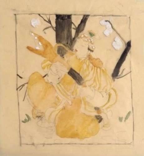
Portrait of Kakunen Tsuruoka by Abel Warshawsky
Courtesy of Doug Tsuruoka
(oils on canvas)
(oils on canvas)
If a comment box does not appear below, click on this link instead: http://easternimp.blogspot.com/2017/06/shrouded-in-fog-california-woodblock.html